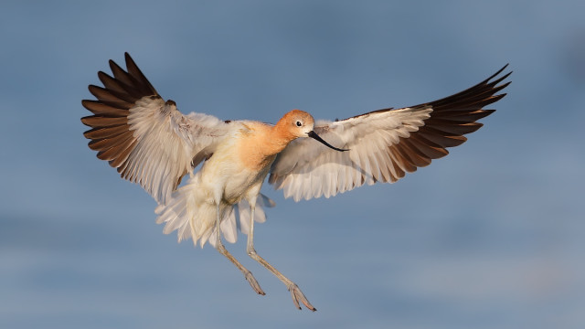
Color correction for avian photography
Introduction:
Effective presentation of a photograph is almost as important as taking the photograph, it plays a significant role in photographer’s success. In the age of mobile internet sharing and displaying art work has become extremely easy. Many photographers display their photographs on various websites and blogs. Those who are more serious often post their images for critique and feedback. The first step in a successful presentation is to make sure that the viewers are seeing a photo the same way the photographer originally intended. Accurate color reproduction will increase the impact of a great photograph. Although this may not be significant to the casual viewer, it is very important for serious photographers. I often see images with strong color casts or poor color balance posted on the critique forums that are otherwise strong in aesthetics. Spending an hour to become familiar with the basic concepts of color correction can greatly improves a photographer’s output quality. This short article is intended to cover the basics of color correction for general wildlife photographer without digging too deep into the technical details.
Step one, choosing the right display:
In order to judge and color-correct a photograph, you need a suitable display. Trying to color correct on a display that cannot correctly render a wide spectrum of colors, is usually a waste of time. The colors will look different when viewed on a different screen. There are a variety of displays available on the market these days, not all displays are suitable for critical image processing though. Thanks to strong competition, there are many low end displays generically labeled as “high definition”, (HD) with high-gloss surfaces. Unfortunately, most of these screens fall short of reproducing an acceptable color spectrum. Here are a few general tips when considering a display for critical image processing:
- Display technology : Today almost all displays are TFT LCD. Most consumer TFT LCD’s use either TN (twisted nematic) or IPS (in-plane switching) technology. TN displays are cheaper but they are only capable of displaying 6 Bits of shade per pixel (18 Bits of RGB). They cannot display the full 16.7 million color (24Bit RGB) that is the standard for most imaging applications. Some manufacturers provide a “fake” 8 Bit mode by using a dithering method that combines adjacent pixels to simulate the desired shade. The IPS or more advanced S-IPS array can display 8 Bits of shade per pixel. These panels also have wider viewing angle and suffer less from the “washout” effect when viewed off-axis. When choosing a display for image processing make sure it use S-IPS technology.
- Back-light : The type of back-light determines how pixels are illuminated. The most common type for larger screens is CCFL or cold cathode florescent lamp. CCFL is low cost but it can have non-uniform brightness over large areas. e.g. one side of the display will look slightly brighter than the other side. The other issue with CCFL is the black level. Since the entire display uses one lamp, in order the produce black, light needs to be blocked by each pixel that is black. However, pixels cannot block the light 100%, even when off, so the black level in such displays is not a pure black. Rendering fine gradation in dark tones becomes difficult. The other popular technology is LED (light emitting diode). LED is more efficient compared to CCFL. The best type of back-light is a full-array LED, where each pixel has an individual LED. A full array LED back-light is completely uniform and since each LED can be turned off individually the display can provide absolute black level with no issue. LED is also brighter than CCFL so the overall contrast ratio (ratio between the brightest and darkest shade the display can show) is better too. For e.g. modern Apple Mac Books use a full-arry LED back-light. Another type of LED back-light is called “edge LED” or edge illuminated LED. This is a low cost alternative to a full array LED. The LED arrays is placed at the rim of the display and a diffusion panel is used to spread the light. This will cancel all the benefits of a full array LED. Such displays are usually inferior even compared to CCFL and should be avoided.
- Size, resolution, DPI: A large display is preferable for working on images as it gives you more freedom and workspace. However, this is only true if resolution matches with the size of the display. Many manufacturers are stuck with the so called HD resolution (1920X1080 pixels) for a variety of display sizes from 20″ all the way to 28″. A larger display with low resolution will make the image look “pixalated”, stretched or crunchy upon close inspection. The low-resolution large displays usually offer no advantage over the smaller one. Some displays have extremely high DPI (pixels per an inch) such as Apple’s retina display with super high DPI. Although these displays are great for reading text, they are not as good for critical image processing. This is because the photos will become too small when viewed on these displays at native size. For e.g. a photo that is 2000 pixels wide, will only fill ~40% of a 15″ retina display when displayed at native size. The image will be too small and it will be difficult to see/judge critical focus, sharpness etc. To tackle this problem, the Mac OS uses some kind of interpolation to re-sizes the photos in order to fill the screen. As a result photos looks “pixelated” and somewhat “crunchy”. If you plan to use a retina display make sure you force it to display photos at native size.
- Color gamut : The combination for the technologies described above plus the quality of the color filter determines the color gamut that a display can show. Some manufacturers state the available color gamut as a percentage of Adobe RGB color space. A display that is suitable for critical image processing should be capable of reproducing at least 98% of the Adobe RGB spectrum. Laptops screens typically struggle to display a wide gamut. The image below show the measured color gamut of two different displays, on the right is the HP ZR30W capable of a wider color gamut than Adobe RGB while the 13″ 2013 MacBook Air is only capably of 50% of Adobe RGB.
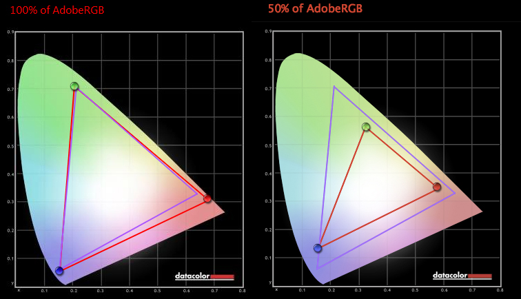
Comparing color reproduction gamut relative to Adobe RGB: Left, HP ZR30W, right, Apple MacBook Air 13″ (2013).
The best displays for color critical applications on the market today are build by NEC and EIZO. Some models are capable of up to 10 Bit display and also include hardware calibration kit, however they are relatively expensive. Pro displays made by DELL, HP, Apple and others that are specifically targeted at imaging/CAD professionals can often offer a good balance between value and quality. A non-glossy surface is preferable for image processing. The reflections on a glossy surface can become distracting and sometimes distort the colors.
Step two, color calibration: Like most precision instruments, even the best displays need calibration off the box. This ensures the colors are displayed correctly by matching the RGB value that is sent to the display and the color that the display shows. In order to perform calibration you need a spectrometer to read the RGB values the display shows. There are a variety of hardware color calibration tools, the most popular models include DataColor and Xrite. I use Spyder 4 pro which is both consistent and easy to use with both Mac and PC. You can find reviews for different calibrators online. The cheapest models are usually not very consistent and best avoided while the top-of-the line models are best if you also plan to calibrate your printer output. One important feature that you should look for is an ambient light sensor so the display can be calibrated according to the ambient brightness level.
What is color correction : Color of an object is determined by the light it reflects, a white object reflects all shades of the visible light and thus is seen white. A green object only reflects the green wavelengths, it absorbs all other colors. If a pure white subject is placed under green light it will look green. Similarly, a subject that is neutral under daylight will look red/orange in evening light when the sun is low in the sky. The same subject will look blue in overcast light. In absolute colorimetric terms, color correction refers to the process of adjusting the relative strength of each of the Red, Green and Blue channels such that a white subject looks white regardless of the light source.
This means the red, green and blue values on a pure white subject should be similar. For example if the RGB value on a white subject reads (150,100,100) this means the image has a red color cast. After color correction, the RGB values should be almost equal, e.g. (120,118,122). In digital cameras, camera’s RGB sensor (sometimes referred to as the white-balance sensor) determines the white balance of the scene by identifying a 18% grey subject (neutral grey) and apply a correction to the RGB values in the final JPEG output. For RAW output, the calculated white balance (WB) is simply stored with the RAW data and applied during conversion. It can be changed by user. Although modern DLSRs have sophisticated RGB sensors, the images taken under some condition often have a color cast. These situations include mixed lightning, low light, artificial light source such as fluorescent or tungsten light etc. It is necessary to apply color correction in many situations for an accurate output. Although color correction can be applied to the JPEG files it is best to do it during RAW conversion on full 14 Bit data to avoid compression and numerical errors.
I use Canon DPP for RAW conversion and my favorite tool for quickly achieving an ideal white balance is the color temperature slider, in the white balance settings. I prefer this tool to the manual white balance tool or click white balance that allows the user to manually specify a white point. Placing the manual WB eyedropper on a neutral surface will give you perfect color correction in absolute colorimetric term, but it often takes away the mood and ambiance of the original scene. For examples, photographs taken in early morning or late evening have a warm color cast that contributes to their pleasing look. The photo below illustrates this point. The Elegant Tern was photographed in late afternoon, at Bolsa Chica wildlife refuge in Southern California.
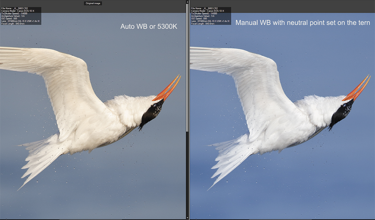
Elegant Tern in evening light. The image on the left is the original with Auto white balance (close to 5300K) set. For the image on the right, white point was set manually on the whitest feathers of the tern. Note that the tern’s feathers look perfectly WHITE (neutral) in the image on the right. Note also that the warm tones created by the evening light are no longer evident. In this case, the image on the left better represents the original scene than the color-corrected image on the right. Canon EOS-1D X EF 600mm f/4L IS II lens + EF extender 1.4X III. ISO 800: 1/4000 sec. at f/5.6 sec. hand held.
Many photographers prefer the image on the left with the warm tones, it looks closer to the original scene.

Elegant Tern roll after a dive. EOS 1D-X EF 600mm F/4 IS II + Extender 1.4X III. ISO 800. 1/4000sec at f/5.6. Hand held.
For most photographs the color temperature method works perfectly, but there are situations where it cannot fully correct the image. This usually happens when the color cast is strong and the number of distinct tones in the image is limited. A perfect example for this scenario is a snowy owl in a cloudy day under low light. In this case the image will come out of the camera with a strong blue cast, similar to the example below.
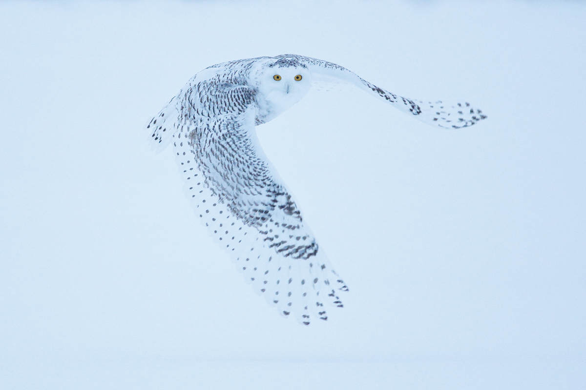
Snowy Owl. RAW output with no color adjustment. EOS1D-X EF 4mm f/5.6 L. ISO 6400. 1/1600sec at f/5.6. Hand held. The image was made early in the morning in an overcast day, it has a strong blue cast.
Color-correcting this image using the color temperature slider is difficult as the blue cast will remain even at 10,000K. The easiest way to correct the white balance for this image is to set white balance manually. I placed the eyedropper on the background right below the owl’s head. The background was snow which should look perfectly white under overcast light. After setting the WB and slightly brightening the image, owl’s feathers turn into pure white and the yellow eyes stand out as they do in a real snowy owl, and at the same time, the cloudy mood of the image is also preserved.
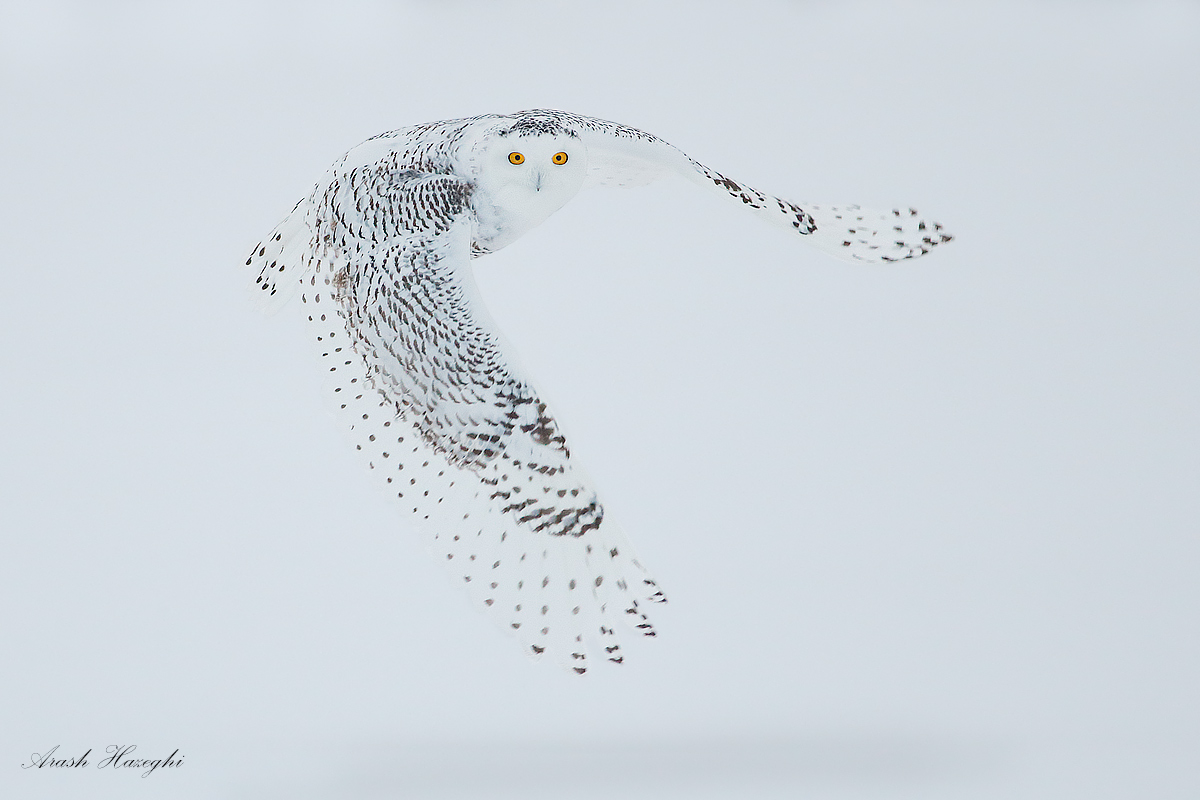
Snowy Owl. EOS 1D-X EF 400mm f/5.6L. ISO 10,000. 1/1600sec at f/5.6. Hand held. Manual white balance in Canon DPP 4.0
In conclusion, color correction is a crucial step in post processing your photographs, a step that is often overlooked. Start with calibrating your monitor first. When doing color correction try to find a good balance between accurate color reproduction and keeping the mood/ambiance of the scene. I hope you found this article useful. To learn more about my processing techniques visit the guides sections.
Hi Arash, excellent tutorial article here. I have only used the color temperature slider to correct for color cast and you a re absolutely right, there are images that can’t be corrected that way. So thank you for the explanation.
Loi
thanks for the wb tip ari. hope to use it next month at boaque on snow geese. take care.
Thank you arash.Doc was great.
Thanks, Arash. This was very helpful.
Ian
Thanks Arash, very informative! Can you recommend a Brand and model number of a display that would fit the above criteria? What do you personally use? Thanks!
Hi Dennis, I use NEC 4K P322UHD but most NEC reference models do the job well